Project Info
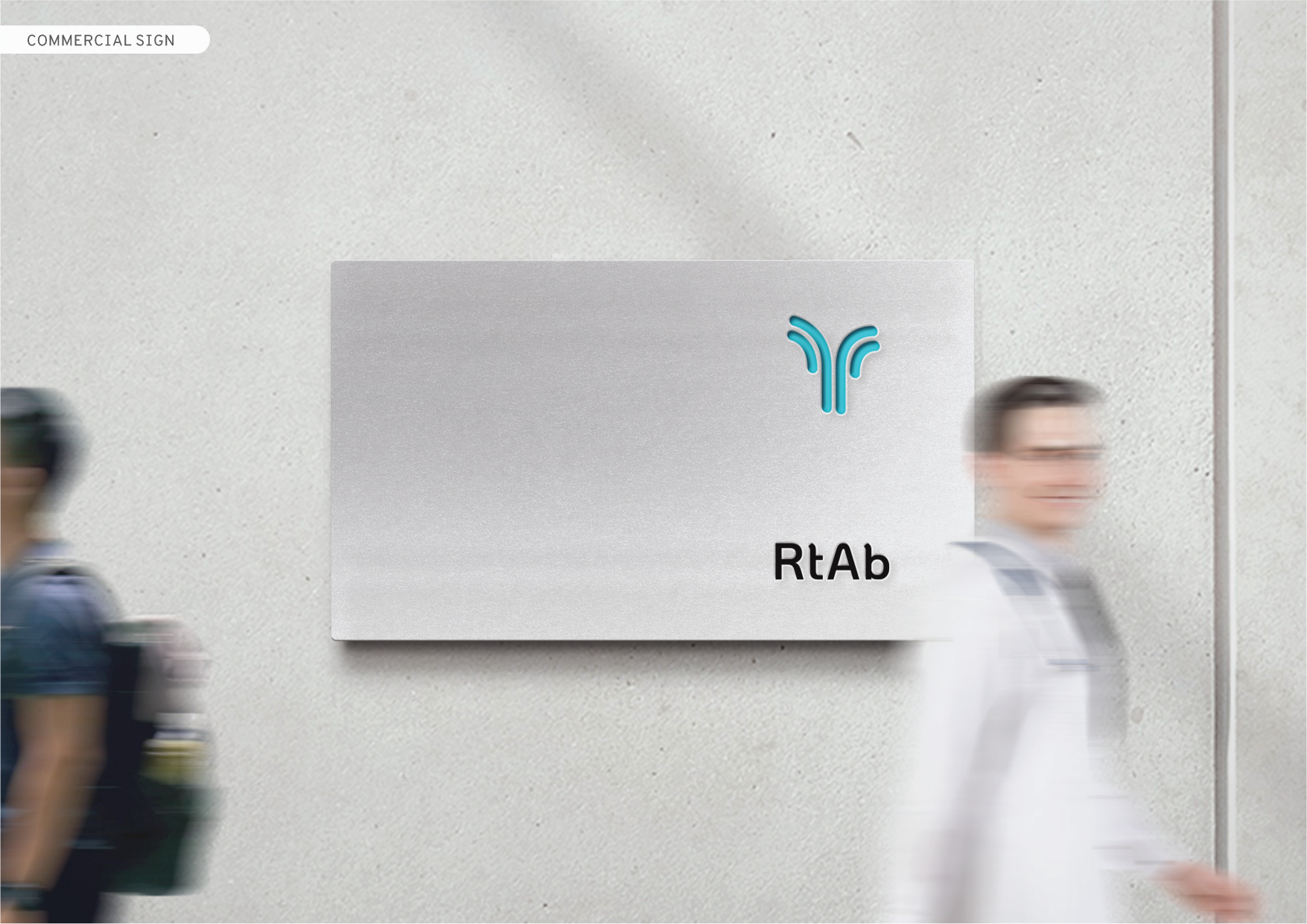
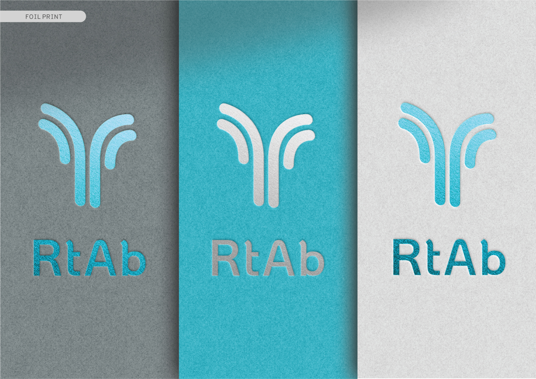
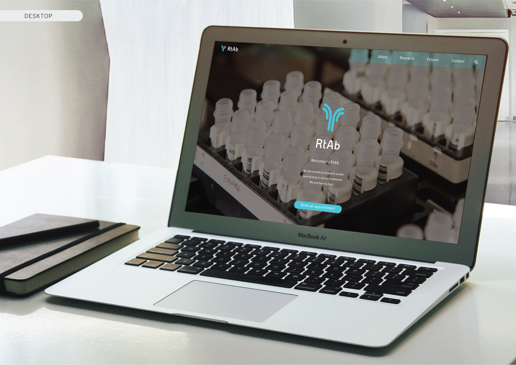
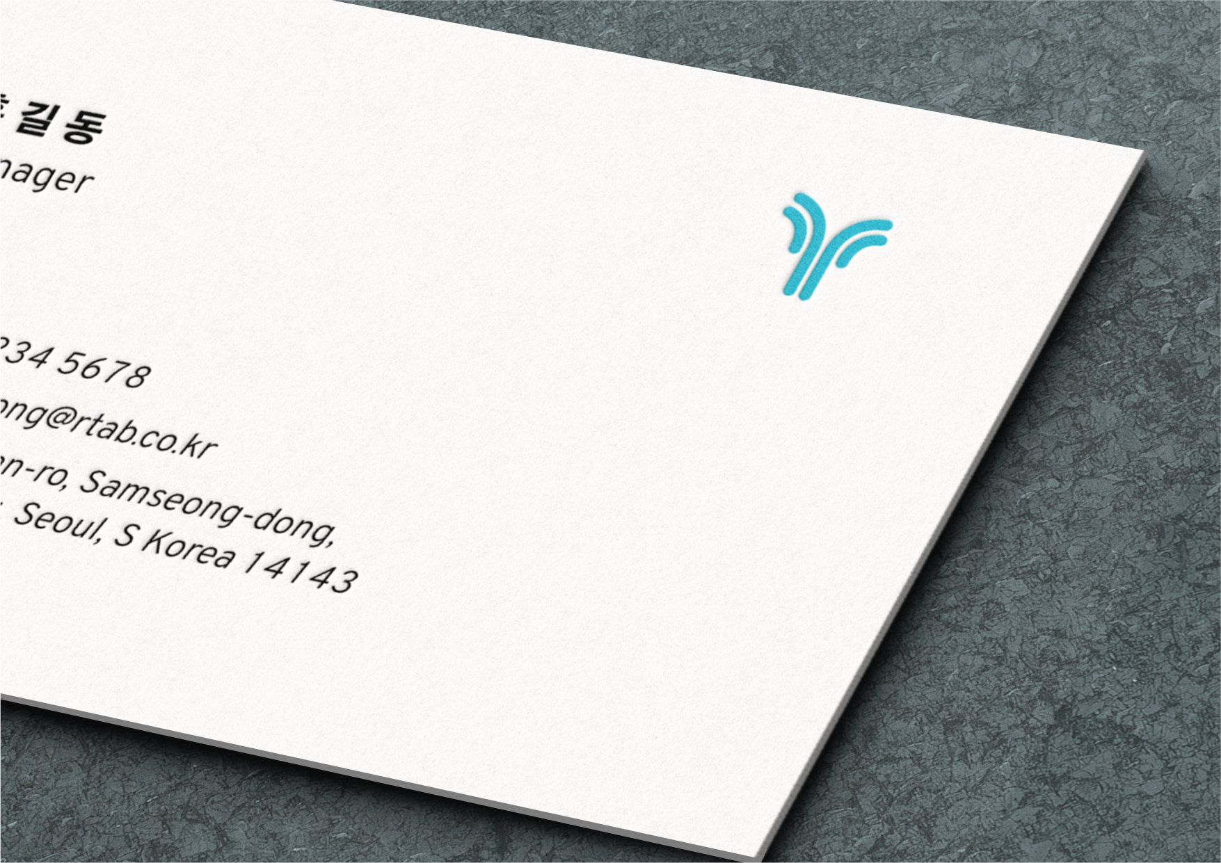
RtAb is a Cancer Research & Treatment Center based in Seoul, South Korea. The design strategy was to strengthen RtAb’s brand by designing a sophisticated & memorable identity. We wanted to help create a brand that was easily understandable for the older generation but also modern enough for the younger generation. The inspiration behind the logo was taken from the shape of an Anti-body protein. The light blue color was chosen for its classic association to the medical industry. The project goal was to create an identity for RtAb that tells customers that our company is one of the best in the industry and that they are here to help.
RtAb is a Cancer Research & Treatment Center based in Seoul, South Korea. The design strategy was to strengthen RtAb’s brand by designing a sophisticated & memorable identity. We wanted to help create a brand that was easily understandable for the older generation but also modern enough for the younger generation. The inspiration behind the logo was taken from the shape of an Anti-body protein. The light blue color was chosen for its classic association to the medical industry. The project goal was to create an identity for RtAb that tells customers that our company is one of the best in the industry and that they are here to help.
Work
Logo
Branding
Logo
Branding